Key Takeaways
- The best font for a CV is a plain sans serif - Arial or Calibri - at 11 or 12 point, the range official UK guidance agrees on.
- ATS software reads character codes, not letter shapes, so a standard font never fails a parse.
- Spaced-out letters, symbol bullets and text saved as an image do.
Every guide to the best font for a CV lists the same three typefaces and the same point range, and none of them says where the numbers come from. They do come from somewhere. The National Careers Service publishes a floor for UK CVs, the government's own accessibility guidance sets a higher one, and Greenhouse - an applicant tracking system used widely by UK employers - publishes a list of what breaks its parser, and the font is not on it. Together they give a more precise answer than "Arial, 10 to 12": a size, a short list of typefaces, and a shorter list of things that look like font decisions and quietly cost you a parse.
What UK Guidance Says the Best Font for a CV Is
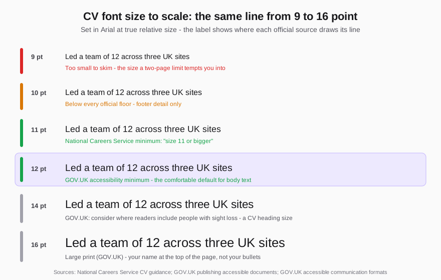
The National Careers Service's CV guidance gives the subject one line: "use a clear font like Arial, Times New Roman or Calibri in size 11 or bigger", with the same style used throughout and headings and bullet points to make it easier to read. That is the only official UK statement on CV fonts, and it is a floor, not a target.
GOV.UK's guidance on publishing accessible documents, written by the Government Digital Service for everything a department publishes, is stricter: "Use a sans serif font like Arial or Helvetica. Use a minimum size of 12 points." It also says to left-align rather than justify, use sentence case, and avoid all-caps text and italics. The Cabinet Office's accessible communication formats guidance repeats the 12-point minimum, suggests 14 point where readers include people with sight loss, and defines large print as 16 point and above. The British Dyslexia Association's style guide lands in the same place: sans serif, 12 to 14 point, headings at least 20% larger than the body, no italics, underlining or block capitals, text left-aligned and never in columns.
None of these documents was written with a recruiter in mind. That is the point: they describe what a wide range of readers can take in quickly, and a recruiter skimming forty CVs in an afternoon is exactly that reader. The sources agree on three things:
- A plain sans serif - Arial or Calibri in practice, Helvetica if you have it.
- 11 point as the floor and 12 as the comfortable default for body text.
- No italics, underlining, capitals for emphasis or justified text. Bold is the one tool left, so use it sparingly.
CV Font Size: 11 or 12 Point, and Why 10 Is a Trap
Body text at 11 or 12 point, headings a step larger, your name larger still. That is the whole decision, and it goes wrong in one predictable way: size is the first thing people shrink when the two-page limit bites.
Point size describes the space a font is set in, not the height of its letters, so Verdana at 11 point looks a size bigger than Garamond at 11 point. "Size 11" is a usable rule only in Arial or Calibri; a narrower face needs 12 for the same legibility. Headings should sit about 20% above the body, per the BDA guidance - 13 or 14 point over an 11-point body - and your name can go to 16 to 20 point.
Three habits keep the size honest:
- Cut words before you cut points. If the CV runs onto a third page, the fix is in the content - the five-step cut in how long a CV should be loses the padding and keeps the keywords. Dropping to 9 point produces a CV that fits and is not read.
- Keep the margins. Word's default 2.54cm margin on A4 leaves a text column of about 16cm, close to the line length readers track comfortably. Margins at 1cm gain a line or two per page and make every line harder to follow.
- Leave the line spacing alone. Word's default of 1.08 with a gap after each paragraph is fine. Condensing it is the same trap as a smaller size, just harder to spot.
Does the Font Matter to ATS Software? Less Than You Have Been Told
A parser does not look at your CV. It extracts the text: every character in a .docx or a text-based PDF is stored as a character code, and the font is an instruction for drawing that code on a screen. "Financial Controller" in Arial, in Garamond and in Comic Sans is the same string of codes to the parser - what ATS actually does with your CV walks through the extraction stage. A standard font cannot fail a parse; an unusual one, on its own, rarely does.
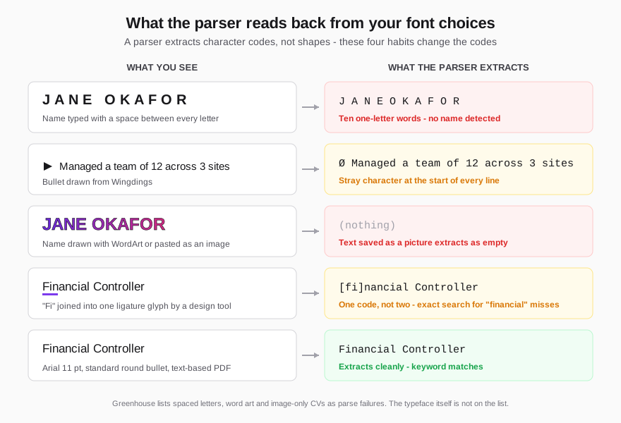
Greenhouse publishes a list of what makes a CV fail to parse in its system. It names image-based CVs, graphics, photos and word art, tables, columned layouts, contact details in headers, footers or text boxes, files over 2.5MB - and "a resume with spaces between the letters". The typeface is nowhere on the list. What is on it is a short set of things people do with fonts that turn text into something the extractor cannot read back:
- Letter-spaced names and headings. Typing your name as "J A N E O K A F O R" stores it as ten one-letter words, and Greenhouse lists the result as a parse failure: no name is matched, and a heading set the same way is not recognised. Wide character spacing in a PDF can do the same, because extractors infer word breaks from the gaps between letters.
- Text saved as a picture. A WordArt name, a heading pasted in as an image and a design-tool export with flattened text all extract as nothing. Our Canva template test measured what flattened text costs.
- Symbol-font bullets. Bullets drawn from Wingdings or Symbol arrive as stray letters or replacement symbols at the start of every line. Word's default round bullet is a standard character and extracts cleanly.
- Ligatures. Some fonts and most design tools join "fi" and "fl" into a single glyph. A well-made PDF maps it back to two letters; a careless one does not, and "financial" is then not "financial" to an exact-match search. Word leaves ligatures off unless you switch them on; Pages and InDesign apply them by default.
The one font mechanism that does catch people is substitution. A .docx does not carry its fonts. Write in a typeface the reader's computer lacks and their software swaps in whatever it has, moving the line and page breaks with it, so your tidy two pages open as two and a bit. A PDF exported from Word embeds the font inside the file, which is one of the reasons a text-based PDF is the right choice for direct applications.
Which CV Fonts to Use and Which to Avoid
The list is short because the safe set is short.
Use:
- Arial - named by the NCS, GOV.UK and the BDA. Installed on everything. The default answer.
- Calibri - Word's default from 2007 until 2023, on the NCS and BDA lists, slightly narrower than Arial so it fits more on a line.
- Aptos - Microsoft's new default, announced in July 2023. Fine in a PDF, where it travels with the file; riskier in a .docx, because a reader whose software lacks it sees a substitute.
- Helvetica - named by GOV.UK. Standard on a Mac; Windows substitutes Arial, which is harmless.
- Georgia or Times New Roman - if you want a serif. Times is on the NCS list; Georgia holds up better on screen.
Avoid:
- Script, handwriting and display fonts. They fail every readability guideline above.
- Comic Sans. The BDA lists it for dyslexic readers; on a CV the reader does not know why you chose it.
- Condensed and "light" weights. Thin strokes disappear on a phone and in a photocopied interview pack.
- Anything you had to download. Not because it fails a parse - it will not - but because a .docx opens in something else on the recruiter's machine.
- Wingdings or Symbol for bullets, and any font used to draw decoration that should be text.
Two fonts is the maximum: one for headings and one for body, or the same face in two weights.
How to Check Your CV Font Survives the Parser
Three checks, ten minutes.
- The copy-paste test. Open the final PDF, select all, and paste into a blank text file. Your name should arrive as one line with no extra spaces, every bullet should start with the same plain character, and words with "fi" or "fl" in them - financial, qualified, workflow - should be whole. Then search the pasted text for a keyword from the advert - if you cannot find it, neither can the parser.
- The embedded-fonts check. Open the PDF's document properties in Adobe Reader or macOS Preview and look at the fonts list. Every font should show as embedded or embedded subset.
- The phone check. Send the PDF to yourself and open it without zooming. If you have to pinch to read the body text, a recruiter on a train will not bother.
FAQ
What is the best font for a CV in the UK?
Arial or Calibri at 11 or 12 point. The National Careers Service names Arial, Times New Roman or Calibri at size 11 or bigger; GOV.UK's accessibility guidance names Arial or Helvetica at a minimum of 12. Either sans serif satisfies both.
Is size 10 font too small for a CV?
For body text, yes. It sits below the National Careers Service floor of 11 and GOV.UK's accessibility minimum of 12, and it is the size a reader on a phone gives up on. Keep 10 for a footer detail at most, never for the bullets that carry your evidence.
Is size 12 too big for a CV?
No. Twelve point is the minimum GOV.UK sets for its own published documents and sits inside the British Dyslexia Association's 12 to 14 point range. If a two-page CV does not fit at 12, the fix is fewer words, not a smaller size.
Can ATS software not read certain fonts?
Not standard ones. A parser extracts character codes and ignores how they are drawn, so Arial, Calibri, Garamond and Georgia are identical to it. What fails is text saved as an image or WordArt, letters typed with spaces between them, symbol-font bullets, and ligatures in a badly made PDF - all of which the copy-paste test catches.
Should the font on my CV match my cover letter?
Yes - same typeface, same body size, same margins. The two documents are read together, and a mismatch makes one of them look borrowed. If the letter is uploaded too, the same extraction rules apply.
The font is rarely what costs you the interview, but spaced letters, flattened text, symbol bullets and a PDF that cannot be copied fail silently, and nobody tells you. Run your CV through Shadow CV's free scan to see exactly what a parser extracts from your file: whether your name, headings and keywords survive, and where the text comes back broken. If it does, the £5 rewrite delivers a clean, parse-safe file in a standard font at a readable size - once, with no subscription.